A logo is not just an image.
It is a set of guidelines to be followed.
The logo, colours and typography are the rules. Once these have been clearly defined, anyone can produce work in keeping with the brand identity — including the printer, the social media graphic designer and the next website designer. Without these rules, a company will look slightly different in every context.
WHY A SYSTEM RATHER THAN A PICTURE
Four factors that determine the usability of a design
A beautiful logo that you can’t use is just an expensive image. These four elements turn it into a tool.
The logo needs different versions, not just a single file
The same logo works differently depending on its size. A horizontal version for the website header, just the logo for social media profiles, and a single-colour version for stamps and stickers. A single PNG file isn’t enough for any of these.
Colour is a number, not an impression
‘Green’ means different things on a screen, in print and in the tape industry. That’s why the HEX, RGB and print equivalents are recorded for every shade — along with the shade used in the text — to ensure readability even in poor lighting.
Typography is part of brand identity
People recognise a company by its typeface before they even have time to read its name. That is why the brand identity includes a selected typeface family, its weights and sizes — and it is licensed so that it can be used both online and in print.
Vector files are durable, image files are not
SVG and PDF files scale from a business card to the side of a marquee without losing any sharpness. When you have a vector file, the next designer can do anything with it. When you only have a JPG, the next designer will have to redraw the logo — and it will end up looking different.
WHAT’S INCLUDED IN THE PACKAGE
A folder you can give to anyone.
The design will be delivered as files and written guidelines, not as screenshots. The copyright will be transferred to you.
Aa Bb Cc 0123
HOW IT’S DONE
Three options, one choice, no endless tweaking.
The direction is decided early on, so that working time is spent on the finishing touches rather than on guesswork.
Background information
A half-hour discussion: what you sell, to whom, and what’s not working with your current look. At the same time, we’ll take a look at what your competitors are doing — so you don’t end up looking the same.
Three directions
Three different proposals, each shown in its intended context: in the website header, on a social media profile and on a business card. Please judge the final result, not the image on a blank background.
The chosen direction is being finalised
One design is chosen and refined to completion. Two rounds of revisions are included in the price; the third and any subsequent rounds are charged at an hourly rate, which is agreed in advance.
Handover
The files, user guide and copyright are transferred to you. You’ll also receive a brief overview of what’s in the folder and what you need to send to the printers.
Work sample
Guidelines to ensure a consistent look and feel
The brand identity comes with a style guide: colours and their roles, typography and usage guidelines, all as a single system. This ensures the look and feel remains consistent on signs, business cards and social media — no matter who creates them. Here are two examples from different sectors.
Brandbook
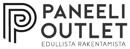
Paneeli Outlet
The timber merchant’s logo, colour palette and typography form a unified system. The same logo, the same colours and the same font family are used consistently from signage to business cards — ensuring the brand identity looks the same everywhere, regardless of who creates it.
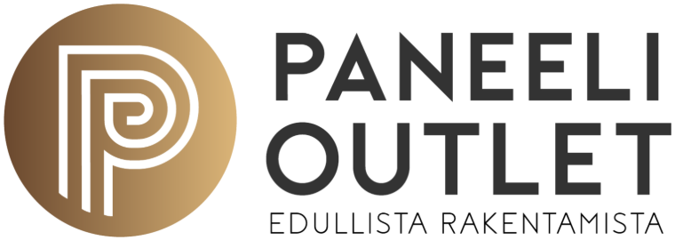
Logo
A P monogram enclosed in a circle, flanked by the word on two lines. The symbol functions on its own as an app icon; the full logo is used in headings and printed materials.
The logo works in gold and in plain black, with or without the circular symbol — depending on where it is used. All four versions are part of the same system.
Colour palette
Backgrounds and large surfaces. An earthy tone that ties the look to timber and construction.
Logo and key headings. Convey a sense of value and quality.
Buttons and focal points, used sparingly. Adds energy without distracting the eye.
Body text and white space on dark backgrounds.
Typography
Geometric grotesque. Clear and bold — features the headlines and logo.
A lighter take on the same family design maintains a consistent look without competing with the headline.
A humanistic grotesque, in a softer style. Good readability even in long texts.
Terms of Use
Leave at least one P-mark’s width of space around the logo so that nothing overlaps it.
The logo works well on its own up to about 24 pixels; the full logo is about 120 pixels wide.
Don’t stretch, invert colours, add shadows or place the logo on a busy background.
Brandbook
Kasvukonstit
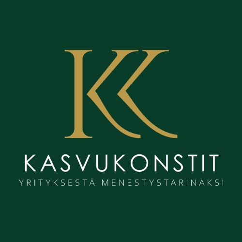
The corporate identity, colour palette and typography form a unified system. The KK monogram, forest green and gold come together to create a cohesive whole that looks just as polished in a brochure as it does in an email signature.
Logo
A monogram woven from two ‘K’s. The square base gives the logo a sense of poise; the symbol also works on its own when space is limited.
The square logo can be used as is or with a gold frame; the KK symbol alone is for small spaces, such as an icon or watermark.
Colour palette
Backgrounds and large surfaces. A solid and timeless foundation for the whole look.
Monogram and headings. Add a touch of elegance to the green.
Depth and support — a secondary dark shade when green is needed to balance the design.
Body text and white space on dark backgrounds.
Typography
A geometric sans-serif typeface with perfect circles. A professional and timeless headline font.
Humanistic grotesque, with a friendly tone. Softens the look alongside the geometric headline.
The same family used for the body text. Clear typefaces, good readability on screen.
Terms of Use
Leave a space around the monogram at least the width of the letter K.
The logo on its own is approximately 28 pixels wide, whilst the square logo is approximately 96 pixels wide.
Do not use gold on a light background without sufficient contrast, and do not stretch the monogram.
PRICE
Fixed price. Two rounds of revisions.
The design is a one-off project with a clear start and end. The price is agreed before work begins and will not change during the project, unless you request additional work yourself.
If you just need your logo spruced up rather than a complete rebrand, just say so — it’s less work and a lower bill.
FREQUENTLY ASKED QUESTIONS
Frequently asked questions.
Will I own the logo afterwards?
You own it. The copyright is transferred to you upon delivery, and there are no restrictions on use: you may use the logo anywhere, edit it and pass the files on to another designer. This will be included in the quote so that there is no need to discuss the matter later.
Can I use my old logo if it’s otherwise good?
You can, and it’s often worth it — brand recognition is valuable and shouldn’t be thrown away needlessly. The work then involves tidying things up: the logo is redrawn as a clean vector, versions and colours are defined, and the missing guidelines are established. It’s clearly cheaper than designing a new one.
What if none of the three options appeal to you?
In that case, something has been overlooked in the initial brief, and that is our responsibility. We will discuss the matter with you in more detail and carry out a new round of work at no extra cost. This has rarely happened, as the concepts are presented early on and in their correct context — not as a polished presentation image that looks good but says nothing.
Do I need a brand identity before I build a website?
You don’t necessarily have to, but doing things in this order saves money. If the brand identity is created first, the website is built directly in line with it. If the website is built first and the brand identity changes six months later, some of the work on the website will have to be redone. If your budget only stretches to one or the other, go for the website — it’s the website that sells, not the logo on its own.
Is the font included?
You’ll be granted the right to use it. We’ll select a typeface for the design whose licence permits both web and print use — in practice, this is usually a font with an open licence, meaning there’s no cost at all. If you’d like a paid font, we’ll let you know the price before you make your choice, and the licence will be purchased in your name.